Images are an essential part of any website but can also be a major source of performance problems. If you don’t optimize images for the web, they can slow down your website and make it difficult for users to view your content.
1) Impact of Image Optimization on Blog Performance
The primary purpose of image optimization is to enable your blog posts to load faster while maintaining high-quality visuals.
Images can occupy more than half the data size of web pages, thereby affecting page load times considerably.
By optimizing your images, you are essentially reducing their file size, which results in faster loading of web pages.
2) Benefits of Optimizing Images
The images on your website are often one of the most common and heaviest resources on the web, so optimizing them can significantly boost performance.
Optimizing images can reduce network time by sending fewer bytes, but it is also possible to reduce bytes sent to the user by serving images that are appropriately sized for their device.
In short, optimizing images for the web has a direct impact on:
- The performance of your website.
- The bandwidth consumed by your users.
Those benefits seem technical, but what do they actually mean?
Regarding bandwidth saving, this not only affects your users but also the bandwidth consumption of your blog.
This saving becomes especially important, if you are using a free blogging platform.
When we speak about the performance of any website, it refers to many things that have important meanings in real life.

A) Performance and User Retention
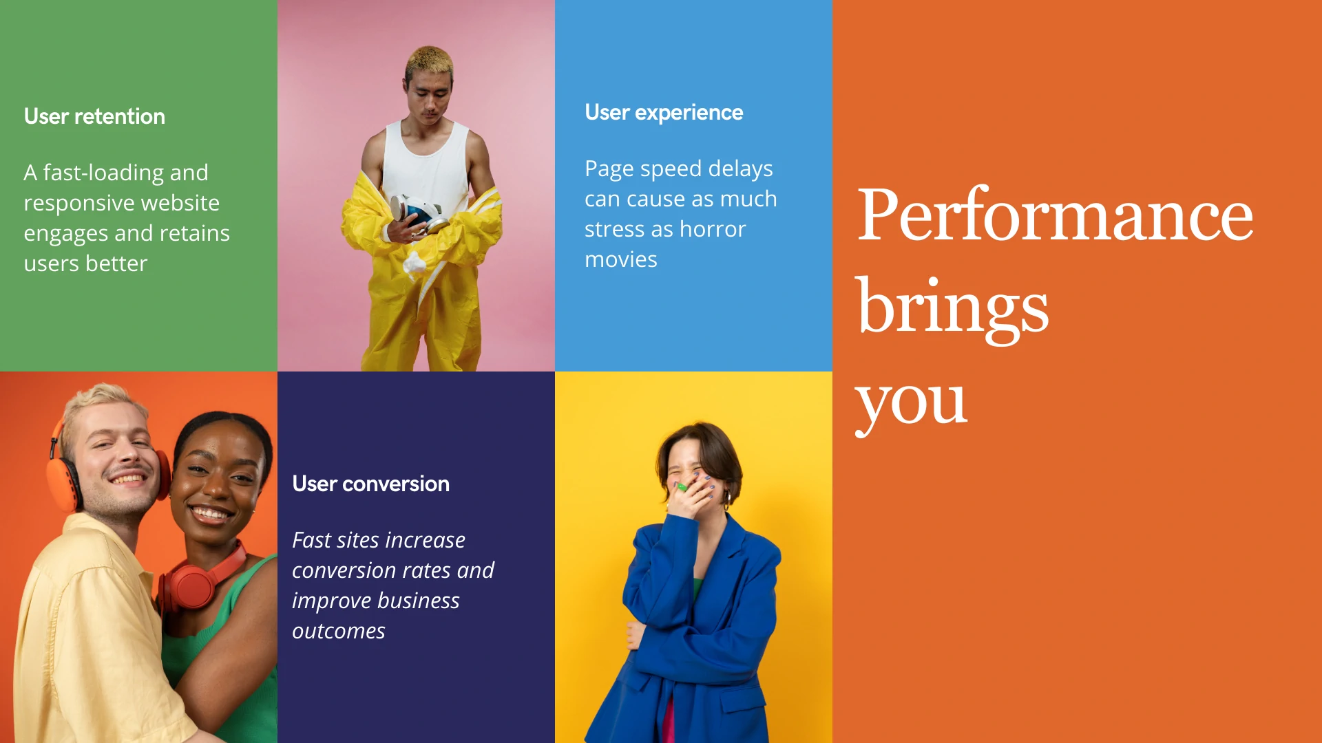
A fast-loading and responsive website engages and retains users better than one that takes time to load.
As an example, the BBC found they lost 10% of their users each second their site took to load. Poor performance has also been shown to negatively impact business outcomes. Performance is key to retaining users!
B) Performance and User Conversion
Performance is directly related to business outcomes, so if you operate an online business, you should prioritize performance if you are not already-your competitors most likely are.
As these case studies demonstrate, slow sites negatively impact revenue, whereas fast sites increase conversion rates and improve business outcomes.
- Revenue per visitor increased by 53.37%, and the conversion rate increased by 33.13% using Core Web Vitals.
- A 31% improvement in LCP resulted in an 8% increase in sales for Vodafone.
- RedBus improved their website’s interaction with Next Paint (INP) and increased sales by 7% as a result.
C) Performance and User-experience
It may take a few seconds for content to appear on a page when it starts loading. On fast connections, this is fleeting. On slower connections, it may take longer.
Consumer studies have shown that page speed delays can cause as much stress as horror movies or solving mathematical problems, as well as waiting in checkout lines.
3) A Methodology for Optimizing Images
To ensure optimized image performance for blogs, it is best to follow a systematic approach involving measuring, testing, improving and monitoring:
- Measurement: Start by evaluating the current loading time of your blog posts with various online tools available.
- Improvement: Use techniques like compression or using appropriate file formats to optimize the image further.
- Monitoring: Monitor these changes to ensure that those images are well optimized without losing image quality.
4) Tools for Measuring Image and Loading Performance
Below is a list of a few popular tools that can help measure image and loading performance:
- Google PageSpeed Insights: This tool provides information about your blog’s loading time on both mobile and desktop platforms.
- GTmetrix: is a tool that helps identify the reasons behind slow loading times.
- SpeedVitals: is a tool to measure the loading times of a website from different geolocations.
5) Techniques for Optimizing Images for the Web
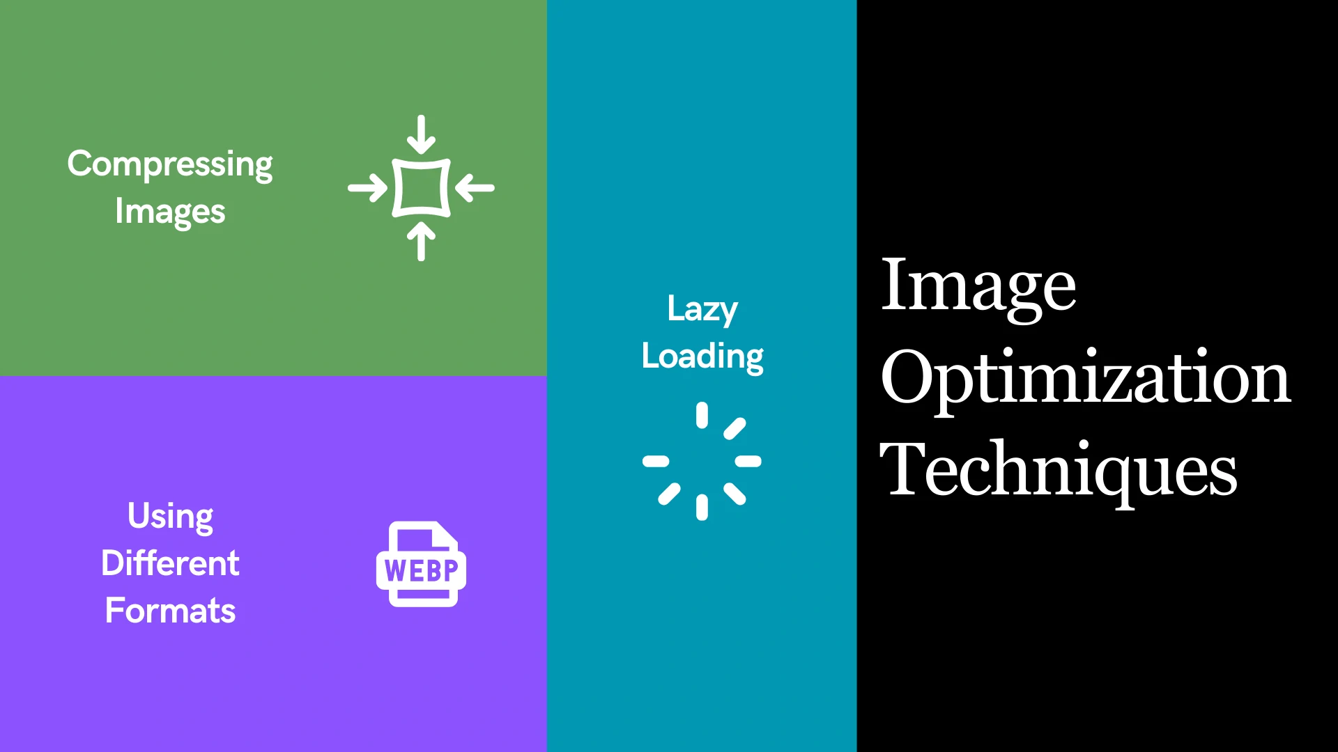
There are a number of different ways to optimize images for the web. Some of the most common methods include:

A) Optimizing Images by Compression
Techniques for compressing images
Image compression is the process of reducing the file size of an image without sacrificing too much quality.
There are a number of different compression techniques available, each with its own advantages and disadvantages.
Some of the most popular compression techniques include the following:
- Lossless compression: Lossless compression does not remove any data from the image, so the quality of the image is not affected. However, lossless compression can only achieve relatively small file size reductions.
- Lossy compression: Lossy compression removes some data from the image, which can result in a loss of quality. However, lossy compression can achieve much greater file size reductions than lossless compression.
The best compression technique for a particular image will depend on the specific requirements of the image.
For example, if the image is going to be used on a website, then a lossy compression technique may be acceptable.
However, if the image is going to be used on a portfolio site, then a lossless compression technique may be necessary.
B) Optimizing Images by Using Different Image Formats
There are a number of different image formats available, each with its own advantages and disadvantages. Some of the most common image formats include:
- JPEG: JPEG is a lossy compression format that is commonly used for photographs and other images with a lot of detail. JPEG images can be compressed to a very small file size, but the quality of the image may be reduced.
- PNG: PNG is a lossless compression format that is commonly used for images with sharp edges, such as logos and icons. PNG images can be compressed to a smaller file size than JPEG images, but they may not be as small as JPEG images.
- GIF: GIF is a lossless compression format that is commonly used for animations and images with a limited number of colors. GIF images can be compressed to a very small file size, but they may not be as high-quality as JPEG or PNG images.
The best image format for a particular image will depend on the specific requirements of the image.
For example, if the image is going to be used on a website, then a JPEG image may be acceptable.
However, if the image is going to be used in a print publication, then a PNG image may be necessary.
Modern image formats and their benefits
In addition to the traditional image formats, there are a number of newer image formats that offer additional benefits. Some of the most popular modern image formats include:
- WebP: WebP is a lossy compression format that is developed by Google. WebP images can be compressed to a smaller file size than JPEG images while maintaining a similar level of quality.
- AVIF: AVIF is a lossy compression format that is developed by the Alliance for Open Media. AVIF images can be compressed to a smaller file size than JPEG images while maintaining a higher level of quality.
Modern image formats offer several benefits over traditional image formats, including:
- Smaller file sizes
- Higher quality
- Support for transparency
- Support for animation
Tools that Optimize Images by Converting them to Different Formats
There are several tools available that can be used to convert images to different formats. Some of the most popular tools include:
- Squoosh: A webpage that allows you to quickly optimize images for your blog.
- ImageOptim: ImageOptim is a free and open-source tool that can be used to compress JPEG, PNG, and GIF images.
- Squash: A powerful batch photo editor for MacOS.
C) Optimizing Images by Lazy-Loading
Lazy loading is a technique that delays the loading of images until they are needed. This can help to improve the performance of your website, especially if you have a lot of images on your page.
Eager loading is the opposite of lazy loading. With eager loading, all of the images on your page are loaded immediately, regardless of whether or not they are visible to the user.
Best practices for lazy loading images
If you are using lazy loading, there are a few best practices that you should follow:
- Only lazy load images that are below the fold. Images that are above the fold should be loaded eagerly.
- Use a placeholder image for lazy loaded images. This will help to prevent the page from looking broken while the images are loading.
- Use a JavaScript library to implement lazy loading. There are a number of JavaScript libraries available that can help you implement lazy loading, such as Lazysizes and Lozad.
How can one implement the lazy loading feature manually?
To implement the lazy loading feature manually, you can use the following steps:

6) Things to Avoid When Optimizing Images
There are a few practices that you should avoid when optimizing images for websites:
- Do not use images that are too large. Large images can slow down your website and make it difficult for users to view your content.
- Do not use images that are not relevant to your content. Irrelevant images can distract users from your content and make it difficult for them to find the information they are looking for.
- Do not use images that are copyrighted. Using copyrighted images can get you into legal trouble.
7) Techniques for Optimizing Images for the Web
In addition to the general image optimization techniques discussed above, there are a few specific things that you can do to optimize image performance in your developer blogs, or in any blogging platforms for developers:
Avoid using background-image in CSS
Using background-image in CSS can slow down your website because it forces the browser to make an additional HTTP request for the image.
Additionally, background-image can make it difficult to control the size and position of the image.
When to consider a background-image
There are a few cases where it may be necessary to use background-image in CSS.
For example, you may want to use background-image to create a parallax effect or to display a large image that spans the entire width of the page.
Avoiding chained requests
Chained requests occur when a web page makes multiple HTTP requests for the same resource. This can slow down your website and make it difficult for users to view your content.
To avoid chained requests, you should use a CSS sprite or an image map to combine multiple images into a single file.
Using srcset in images
The srcset attribute allows you to specify multiple image sources for a single <img\> tag. This can help to ensure that your images are displayed at the optimal resolution for the user’s device.
To use the srcset attribute, you simply need to specify the different image sources and their corresponding resolutions. For example:

Understanding the sizes attribute
The sizes attribute allows you to specify the size of an image relative to its container. This can help to ensure that your images are displayed at the correct size for the user’s device.
To use the sizes attribute, you simply need to specify the width of the image in pixels. For example:

Modern formats with the picture tag
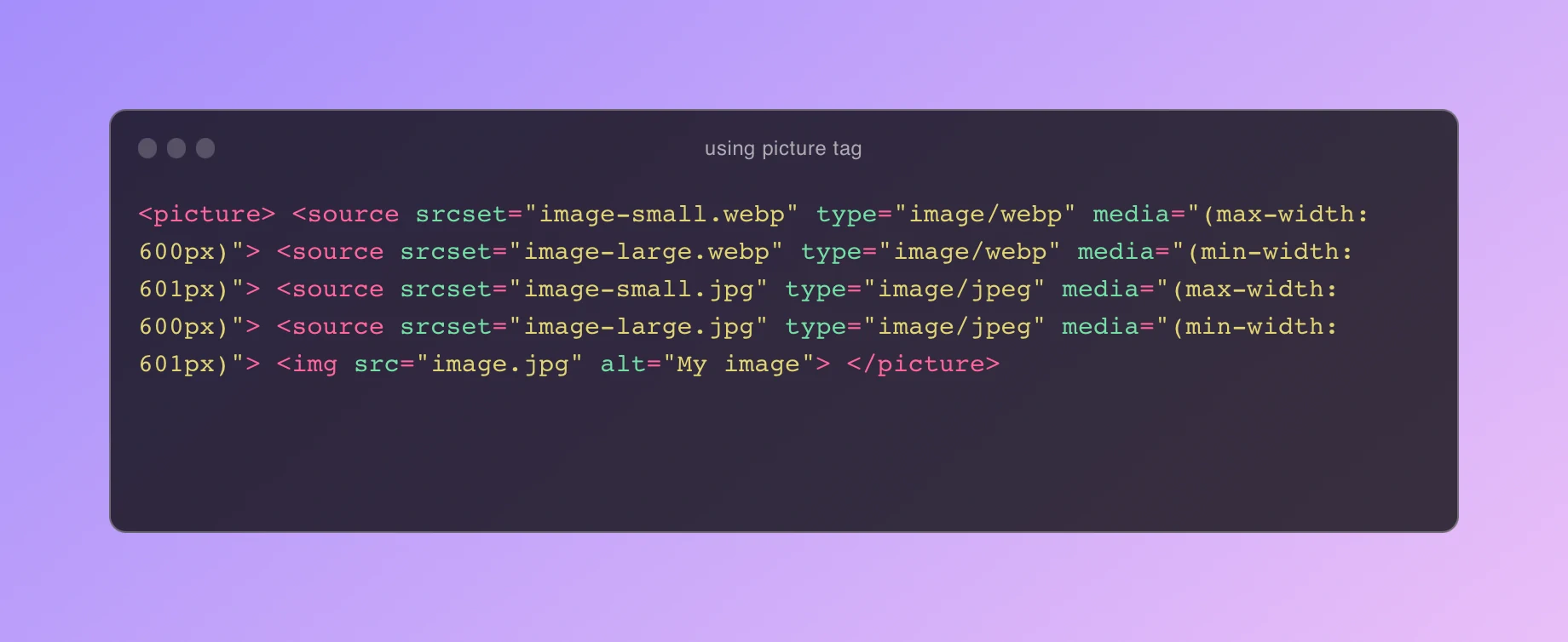
The picture tag allows you to specify multiple image sources for a single image. This can help to ensure that your images are displayed in the best possible format for the user’s device.
For example, you could specify a WebP image for browsers that support it, and a JPEG image for browsers that do not.
To use the picture tag, you simply need to specify the different image sources and their corresponding media queries. For example:

The browser will then choose the most appropriate image source based on the user’s device and the media query rules.
The picture tag is a powerful tool that can help you to deliver the best possible image experience to your users.
By using the picture tag, you can:
- Use modern image formats: WebP and AVIF are modern image formats that offer better compression than JPEG and PNG. By using the picture tag, you can specify WebP and AVIF images for browsers that support them.
- Deliver responsive images: The
picturetag allows you to specify different image sources for different screen sizes. This ensures that your images are displayed at the optimal resolution for the user’s device. - Improve performance: By using the picture tag, you can reduce the number of HTTP requests that your website makes. This can improve the performance of your website, especially on mobile devices.
If you are not already using the picture tag, I encourage you to start using it today.
The picture tag is a simple and effective way to improve the performance of your website and deliver the best possible image experience to your users.
Using aspect-ratio in images
The aspect-ratio attribute allows you to specify the aspect ratio of an image. This can help to ensure that your images are displayed at the correct proportions.
To use the aspect-ratio attribute, you simply need to specify the width and height of the image in pixels. For example:

Async image decoding
Async image decoding allows the browser to decode images in the background. This can help to improve the performance of your website, especially if you have a lot of images on your page.
To enable async image decoding, you simply need to add the decoding="async" attribute to the <img\> tag. For example:

Resource hints
Resource hints are a way to tell the browser that it will need to load a particular resource soon. This can help to improve the performance of your website by reducing the number of HTTP requests that the browser needs to make.
To use resource hints, you simply need to add a <link\> tag to the <head\> of your document. For example:

We have discussed a number of different ways to optimize images for the web. By following these tips, you can optimize images for your blog. As a result, you gain the benefits I already mentioned in this article.
Additionally, there are already blogging platforms offer advanced image optimizations to check.
Moreover, you can always explore the best blogging platforms.
